

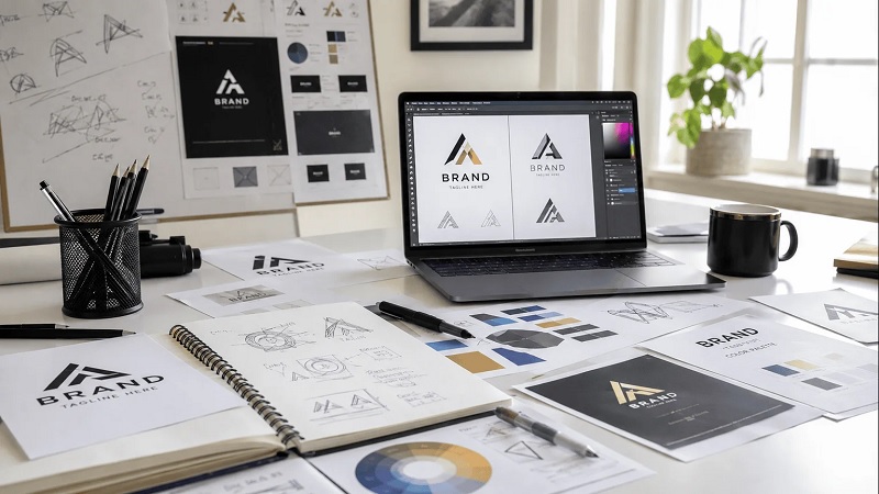
Every day, consumers are bombarded with thousands of commercial messages, advertisements, and digital storefronts. In this saturated environment, the human brain ruthlessly filters out the noise, relying on rapid visual processing to decide who to trust and who to ignore. At the absolute center of this visual triage is your company’s logo. Many emerging business owners mistakenly view a logo as a mere decorative afterthought, something to be hastily generated online or sketched out just to get a website live.
However, treating your primary visual identifier as a generic checkbox is a strategic misstep that can quietly sabotage your growth. Professional logo development is not about creating a pretty graphic; it is about engineering a highly concentrated psychological asset that instantly communicates your market position, establishes undeniable authority, and anchors your brand in the mind of the consumer. Understanding the mechanics behind this process reveals exactly why professional design is a non-negotiable business investment.
Moving Beyond Aesthetics: The Psychology of Visual Design
A professionally developed logo operates on a subconscious level before the conscious mind even registers the name of the company. Master designers understand that they are not just drawing shapes; they are manipulating the fundamental principles of human cognition. Every single curve, angle, and hue is a deliberate choice designed to evoke a highly specific emotional response that aligns with your business objectives.
Color Theory as Silent Communication
Color is never an arbitrary decision in professional design. It is a silent language that dictates how a consumer feels about your brand in the first millisecond of interaction. A healthcare technology startup requires the clinical trust and calm stability inherently associated with specific shades of blue and clean white. Conversely, a disruptive fitness brand needs the aggressive, high-kinetic energy projected by vibrant reds or electric oranges. A professional designer does not simply pick colors that look nice together; they select a precise color palette that subconsciously tells your target demographic exactly what to expect from your services before they read a single word of your marketing copy.
Typography and the Cadence of Your Brand Voice
Just as the tone of a person’s voice changes the meaning of their words, typography changes how your brand name is interpreted by the public. A heavy, traditional serif font projects legacy, institutional stability, and luxury, making it highly effective for wealth management firms or boutique law practices. Alternatively, a clean, geometric sans-serif typeface communicates modern efficiency and approachability, often utilized by software companies and direct-to-consumer lifestyle brands. Professional logo development involves meticulously kerning and sometimes entirely customizing letterforms so that the typography itself becomes an unshakeable pillar of your unique identity.
Establishing Immediate Industry Authority
In the absence of a personal relationship or a direct referral, consumers judge the competence of a business almost entirely by its visual presentation. If a company claims to offer premium, high-ticket consulting services but utilizes a disjointed, amateurish logo, a profound cognitive dissonance occurs. The consumer’s brain immediately flags the inconsistency: if this company cuts corners on their own foundational identity, where else are they cutting corners?
Professional logo development eliminates this friction entirely. When your visual identity is crisp, balanced, and deliberately crafted, it projects an aura of established success and uncompromising quality. A strong logo essentially acts as a visual handshake, assuring prospective clients that they are dealing with a serious, highly capable entity. This immediate projection of authority drastically reduces the friction in your sales cycle, as consumers are naturally drawn toward brands that look like established industry leaders rather than risky, unproven startups.
The Imperative of Scalability and Versatility
One of the most catastrophic failures of amateur logo design is the inability to adapt to different physical and digital environments. A complex illustration might look fantastic when stretched across a massive desktop monitor, but it will inevitably dissolve into an illegible, muddy smudge when shrunk down to a tiny social media profile picture or printed on a promotional pen.
Engineering for Contextual Adaptability
Professional logo development is rooted in functional versatility. Master designers build identities using mathematically precise vector graphics rather than pixel-based images. This ensures the logo retains absolute sharpness whether it is embroidered on a corporate polo shirt, stamped into leather, or blown up to the size of a highway billboard.
Furthermore, a professional will develop an entire logo system rather than a single static image. This structural system typically includes a primary logo, a simplified secondary mark for tight horizontal or vertical spaces, and a monochromatic version that remains perfectly legible when printed in black and white or engraved on metal. This structural versatility ensures your brand remains instantly recognizable and cohesive across every conceivable medium.
Creating Memorability Through Strategic Simplification
The human brain struggles to recall complex, intricate images, but it effortlessly stores and retrieves simple, bold geometry. If you examine the most iconic and enduring brands in the global economy, they all share a singular visual trait: radical simplification. Their logos are stripped of all unnecessary gradients, complex drop shadows, and intricate illustrative details, leaving only a distilled, potent mark.
Amateur designers often try to tell the entire chronological story of a business within the logo, crowding the canvas with literal representations of the product or service. A professional designer understands that a logo is an identifier, not a comprehensive resume. The goal of professional development is to subtract until nothing else can be removed without losing the core identity. This rigorous simplification is what makes a logo memorable. When a consumer can easily recall and mentally visualize your logo days after seeing it on a passing delivery truck or a fleeting digital ad, you have successfully occupied highly valuable real estate in their mind.
Ensuring Long-Term Financial Efficiency
A common objection to professional logo development is the upfront capital required. Small business owners frequently opt for cheap crowdsourcing platforms or automated internet generators under the guise of fiscal responsibility. However, this approach almost always results in a massive, hidden financial penalty down the line.
When a business launches with an inadequate logo, it eventually hits a growth ceiling where the brand’s visual presentation actively repels larger clients, institutional investors, or premium retail partnerships. This ceiling forces a complete corporate rebranding effort. Rebranding is astronomically more expensive than doing it correctly the first time. It requires you to throw away existing packaging, redesign websites, replace physical signage, and worst of all, sacrifice all the visual equity and brand recognition you managed to build with your original audience. Investing in professional logo development from the outset protects your capital, providing a durable foundation that can support your company’s growth for decades rather than requiring a costly demolition and rebuild just a few years into your journey.
The Anchor of Your Corporate Narrative
Your business is a complex ecosystem of products, customer service interactions, company culture, and strategic vision. A professionally developed logo serves as the visual anchor for this entire narrative. It is the single flag under which your employees rally and the most consistent, unyielding touchpoint for your customer base.
When consumers have a positive experience with your company, that goodwill becomes psychologically attached to your logo. Over time, the logo stops being just a piece of graphic design and becomes a vessel for your reputation. When a past client sees that mark out in the wild, it instantly triggers the memory of the quality you delivered, prompting repeat business and organic word-of-mouth referrals. You cannot build this kind of enduring, visceral connection with a generic piece of clip art. It requires the deliberate, strategic architecture that only professional logo development can provide. Treating your visual identity with the uncompromising respect it deserves is the critical first step in transitioning from a forgotten commodity to an unforgettable brand.
Comments are closed.